
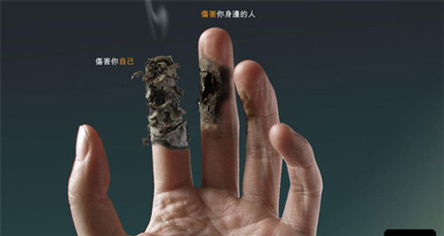
The mandarin caption translates to, your hurt yourself and you hurt the others around you.
The two pictures above are from different advertisements, however, they relate to each other.
I do not like the layout, and design of the first advertisement. The fonts and the word alignments seem very amateurish, although there is a contrast with the white words against the black background. However, it's one redeeming factor is the picture of the woman, it is impactful and is about to fulfil it's intention of having people to not or stop smoke. This is because, the picture scares people and is enough to prevent them from ever wanting to end up like her. Overall this advertisement does not appeal to me although it does get its general message out. It can improve on its background design and perhaps change its font to a different typography.
The second picture is a better advertisement in terms of layout and the single picture of the hand is more impactful as it directs the attention to it. The ombre background is easier on the eyes and matches the skin tone of the hands. I like how the words are smaller and is still able to get its message across because the picture would intrigue the audience's attention.
This is an example of how two advertisements with the same intention can look different just with the background and typography.
No comments:
Post a Comment